Lead and illuminate.
Whitireia is named after the Whitireia maunga (mountain) of Titahi Bay – the mountain that Ngāti Toa Rangatira identifies with, the highest mountain in their rohe. From its inception in 1985 Whitireia has a proud history of fostering partnership, with the community, with ākonga, with the workplace and connecting with the national arena.
Task
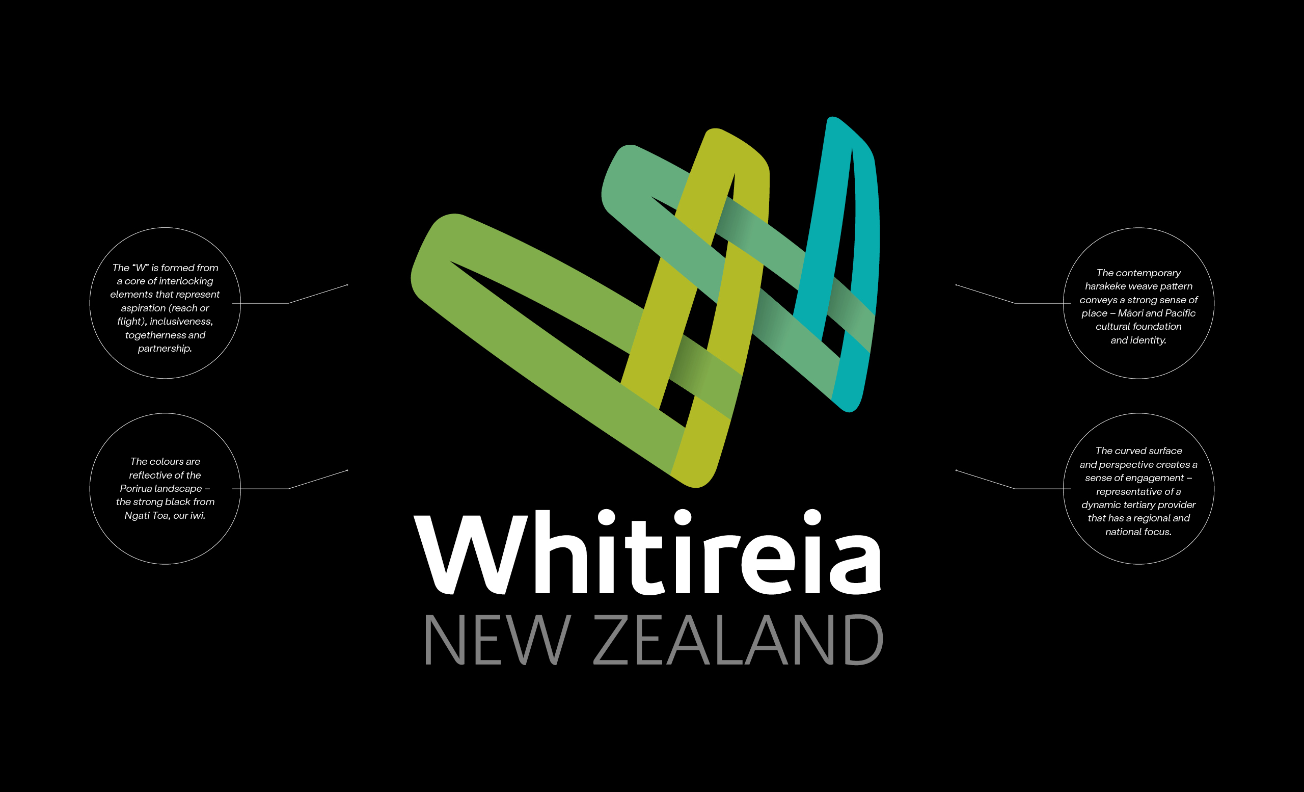
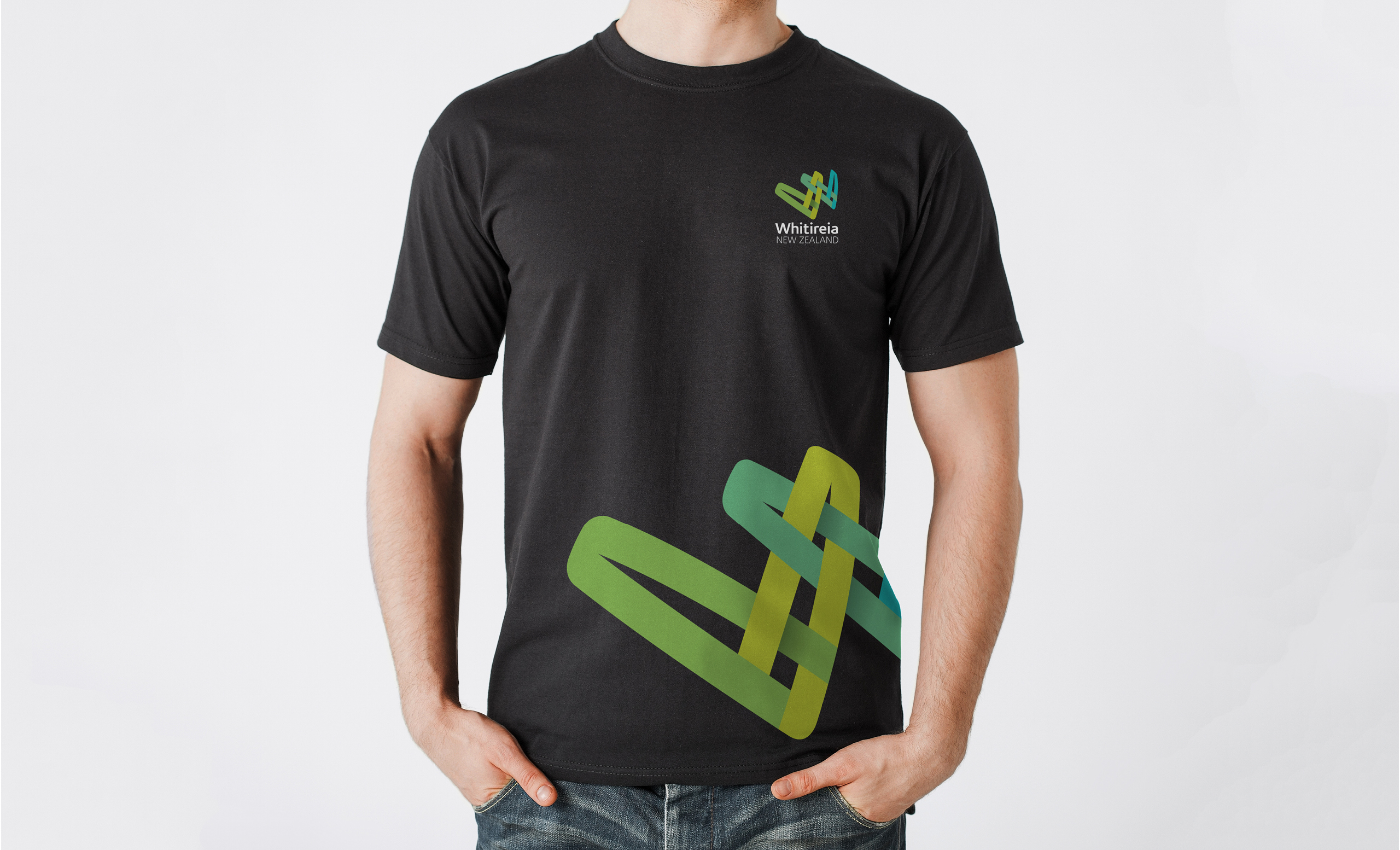
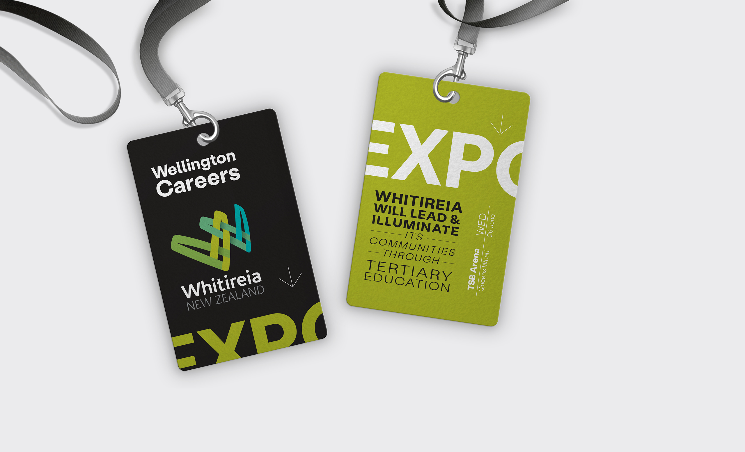
Our task was to create a visual identity that reflected both the history (hītori) and distinctiveness (ahureitanga) of Whitireia. An identity that would signify the relationships that Whitireia fosters. It is inclusive and local while showing the substance, scale and success as a regional leader. Learning together. Transforming lives. Te ako ngātahi. Te whakaahua kētanga o te tangata.
Working closely with the internal Marketing team, and through a rigorous stakeholder feedback loop, we developed a dynamic and eye-catching logo – something that Whitireia could ‘own’, and push-out into the marketplace with confidence and pride.
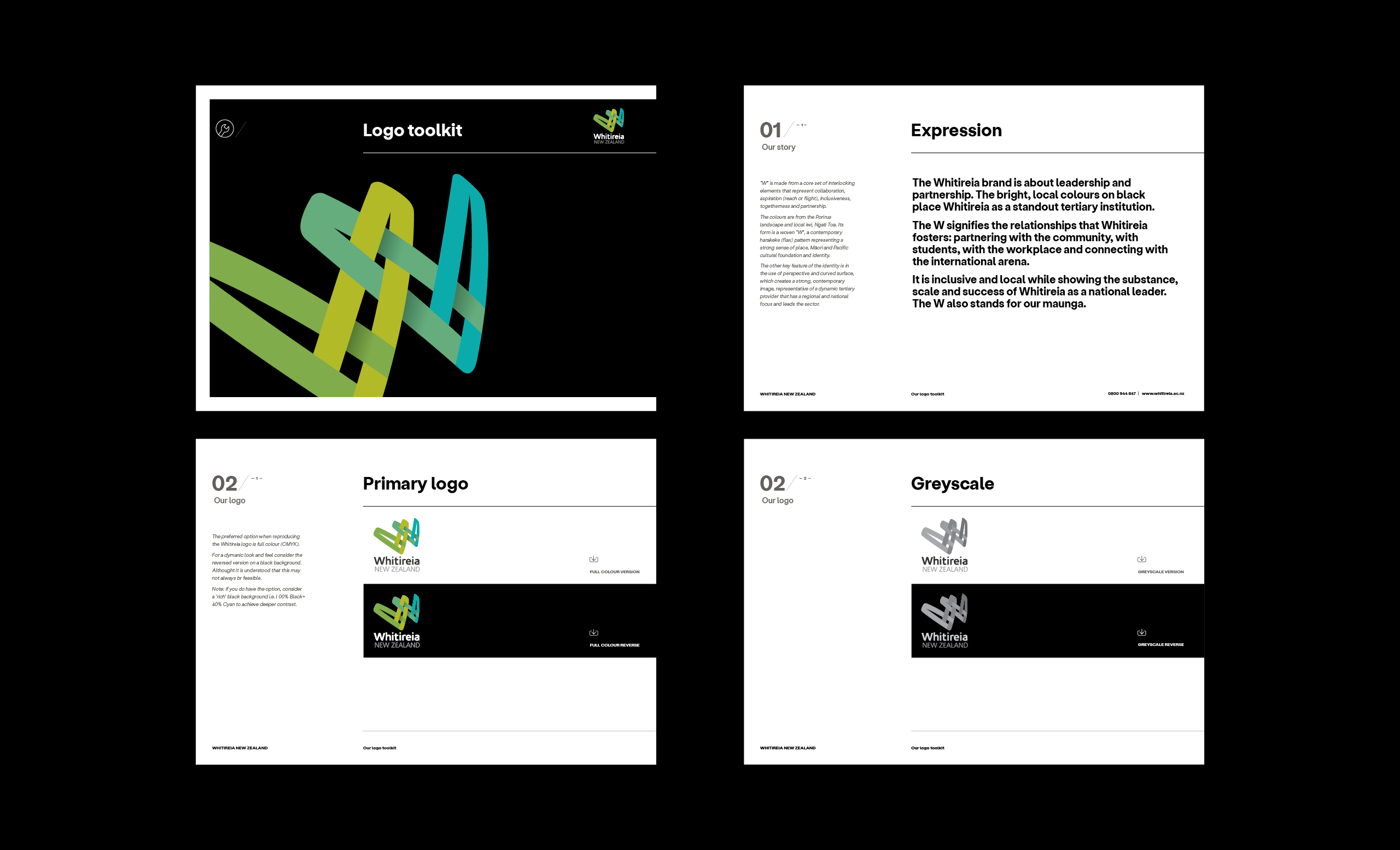
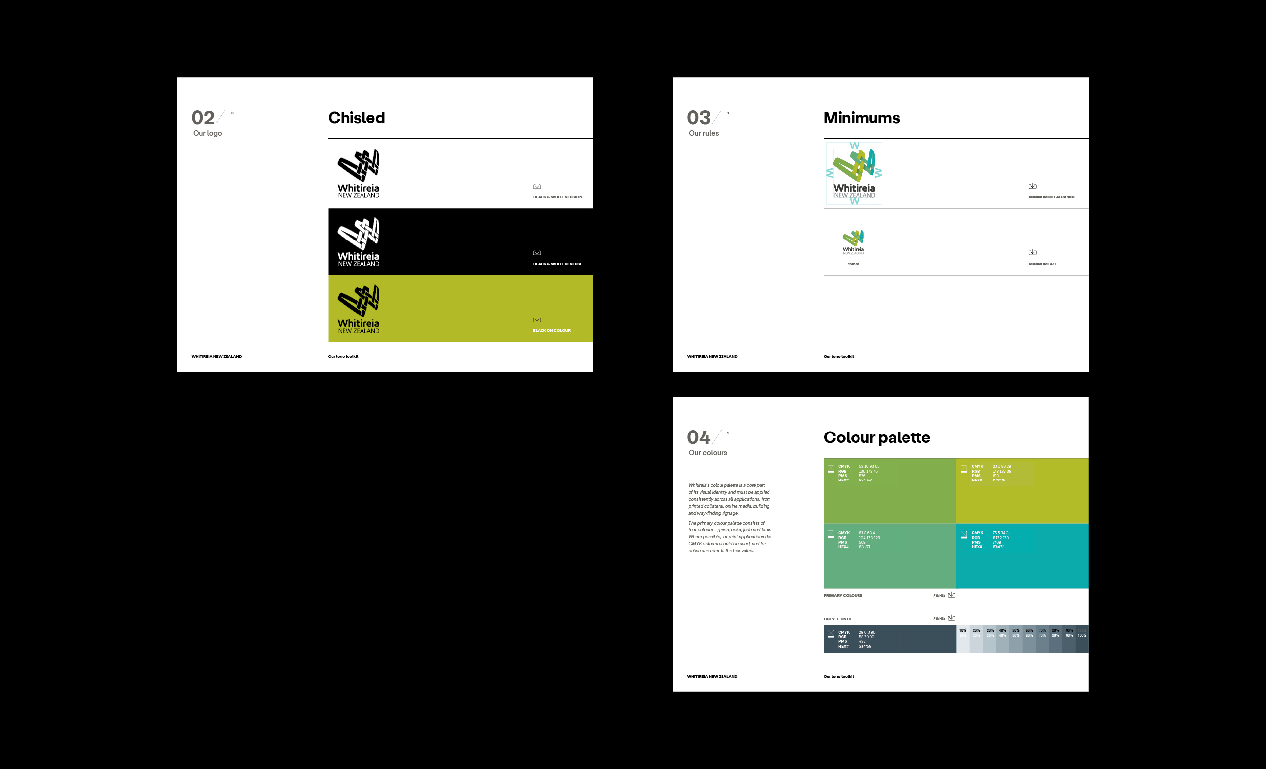
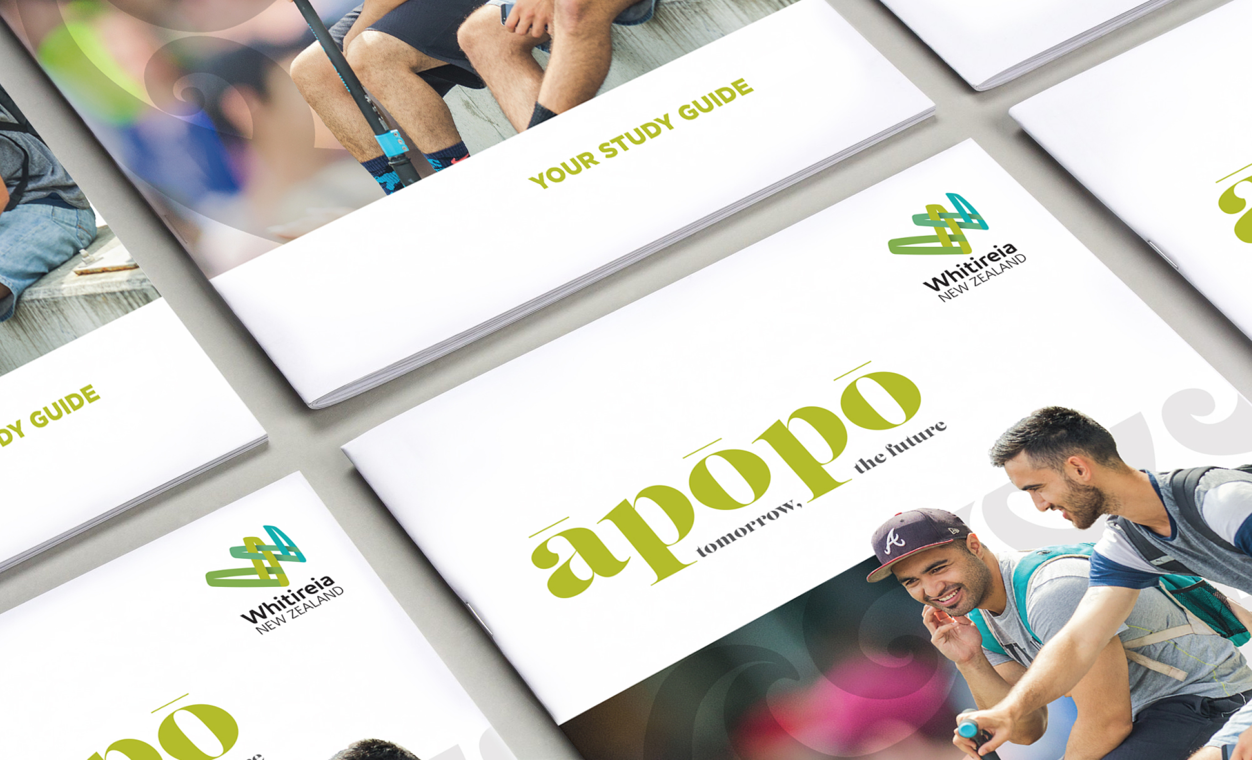
As long-term brand champions we were tasked with ensuring visual communications were consistent and inline with the brand guidelines, across print, online, environmental and signage applications.
Brand story
— Whitireia
Creative design
— Tangerine
We’re a team of creatives – excited about our next project. Seeing is believing, and believing is everything. That’s one reason of many we’re not called beige.